Friday, November 4, 2011

Design Theory Exam

Brooch A- it’s a brooch that has a smooth surface, made up of white metals overall and small features of yellow metal. The front of the brooch has been designed with perspex and underneath placed with a 3D abstract photo of a building or a house. On the edge there is patterned line that surrounds the house which looks like some kind of a fencing of the property. The back of this brooch is designed mechanically with features of an organic feel of natural trees and leaves. The leaves make a movement of like a snake. At the bottom of the are small spikes which looks like grass. This brooch at the back is made up of white metal and the yellow metal has been placed at the top off centre to the left and at the bottom off centre to the right. Underneath there are mechanism objects which are various sizes and with different pattern designs on the circles. The brooch has different surface treatments on the back and it’s heavier on weight. The back is more like an abstract; it makes the eyes to move everywhere.

Brooch B- Has a halo construction which has been plated with yellow metal on the inside, the brooch has six white metal unusual triangle pieces soldered on the front and the centre sweat soldered with a yellow metal ball. The way the designer manufactured this design, he/she made it to look like an umbrella. It’s been designed to have a less weight. It has both organic and mechanism feel, the surface is totally smooth and as well it has that first stage polished feeling

Thursday, October 6, 2011

4th Term Written Assignment (klimt 02)


Oscar Abba's Designs

Oscar Abba
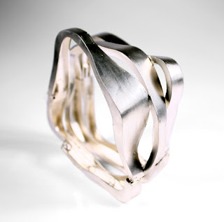
Bracelet: Folds 2011
Silver


Oscar Abba
Bracelet: Folds II 2011
Silver


Oscar Abba
Brooch: Liquids II 2007
Silver


These pieces of silver are symmetrically and organic, having that natural feeling. Each strip has been soldered with another where these metals joins. There is tapering on it from wider to thinner. The surface of the piece has been brushed polished. The designer used a roller for the depth and the show of volume on each of these pieces, thickness of this bracelet and the hinges have been created on two sections which makes it easier to open and close(functionality). The design was more designed in a flowery way because it looks usually that these metals have been recycled from a bin its more a scratched waist of sliver pieces and the names of these pieces just suits them “folds, folds II and liquids II”.

Folds-The metal thickness on this piece is not equal,it has a muscular look and feeling because of the way it has been formed and designed. Its more havier on my perspective of view and it is an unusually design mean its more unique.

Folds II- Its unusually but I cant cleary say something more about the thickness of this piece because most of the area its more equally thickness and it is has a less mass weight than "folds I". It has some bends on it too.

Liquids II- this piece has been manufactured with four strips of silver metal all having the same thickness on my perspective view, the designer made the two strips more to a straight line but not completelly and soldered others perpenducular.

Thursday, September 29, 2011

Dubious Designs/Improved Designs

My dubious design


This mug is made up of metal. It is not a good design to me because when you use it for drinking coffy it burns you and when drinking something cold it produce cold on your hands.


My improved design

This is the latest fashion vest it is my most iproved design because it has been made to stretch if someone can attempt to pull you by it it wont easyl break but instead it will stretch...and the moment you let it go it goes back to the normal structure. Its so flexible for most people to wear it. I just love it...wow.

Monday, July 18, 2011

Brief on Two Jewellers

Farrah Al-Dujaili
 Farrah Al-Dujaili lived in United Kingdom, were she is working independently as jewellery design maker in a studio. She recently finished an MA at The School of Jewellery at Birmingham. She has been selected for “MEDITERRANEO” an international contemporary jewellery exhibition. The colours and marine life of the Mediterranean inspired the selected piece ‘Codium very l lara’, and she was also one of ninety five designer makers to be selected to exhibit at Talente at the International Trade Fair in Munich in March this year.
Her design methodology revolves around the act of drawing as an intuitive and subconscious process; geometric and organic components ‘grow’ alongside each other to create visual contrasts. Through a palette of feminine and masculine symbols, heavily detailed flowers and geometric shapes and crosshatched lines hybrid forms are created; not overtly floral, but organic and playful.
She is making immersed in metalwork because of the material’s ability to be visually delicate but physically strong. Fragments are created and later constructed to create the idiosyncratic detailing that appears in my drawings. She works within an intuitive mix of drawing and making that crosses over and intertwines.
Her drawing materials are pencils, crayons and watercolours to a surface of enamel paints. This gives an interesting material link to her design methodology, enforcing the dialogue between drawing and making.

 Farrah Al-Dujaili
Brooch: Untitled 2010
Copper, enamel paint, watercolor pencil
17 x 18 x 7 cm

A brooch: This piece is simpler in vision which also illustrates the geometric and organic shape of a cylinder in 3d, and 2d circles and rectangles, attached with few lines; frames are produced by these lines around it. It is light in mass and more balanced the way it has been designed.


Farrah Al-Dujaili
Necklace: Untitled 2011
Copper, enamel paint, watercolour, pastel, thread
9.5 x 23 x 4 cm

Necklace: It’s symmetrically, twisted or kind of a waves, crossed lines on the oval organic path which also doesn’t look balanced the way I see it and the is a space that takes place in this piece.
Farrah Al-Dujaili
Brooch: Untitled 2011
Copper, enamel paint, watercolour, watercolour pencil, pastel
5.5 x 4 x 2 cm

Brooch: Also Geometric and organic, it has a feeling of being spiky, pretty balanced by the circle underneath on the left with the spikes on the right top corner, lining has been used and space, also symmetrically with the contrast of colour happening in there too, and also gives some un even square shapes.

Mari Ishikawa
Mari Ishikawa was born in 1964, in Kyoto, Japan. She attained her Masters Degree of Art at Nara University of Education in Japan (1982-86), then studied jewellery making at Hiko Mizuno Collage of Jewellery also in Japan (1993-94). She is currently residing in Germany where she also studied jewellery at the Munich- Academy of Fine Art (1994-2000).
She has worked in public collections at the Museum of art and design, New York, USA and she has been awarded The Award of “Bayerischer Staat Preise in 2010”. She has done her solo exhibit of the “Moon Light Shadow” 2009.

Mari Ishikawa
Ring: Moonlight Shadow 2009
Gold 750, Silver 925
8 x 6,5 x 4 cm

Ring: Depth of volume on the insertion path, seems quite a bit heavier, texture is smooth. It is also well balanced by the organic leaves with a gold wiring line running across the other side of the ring.
Mari Ishikawa
Necklace: Moonlight Shadow 2008
Silver 925
58 x 9 x 4 cm
Necklace: The chain seems to be spiky, the pendent is like made from a bark of a tree with small flowers on and it is patined, shows some colour. It is a bit rough too.

Mari Ishikawa
Brooch: Moonlight Shadow 2008
Silver 925, Diamond
10,5 x 6,5 x 2,5 cm

Brooch: It has leaves behind the bark and a line that is crossing on the right which I think it’s a root, the bark has a rough texture and wide on size which makes it more rectangle, it’s light on mass.

References
2. crafthays.ning.com/../farrahaldujaili
Thursday, June 9, 2011

Research Paper on a Particular Design

Fashion design is the art or a skill of the application of design and natural beauty to clothing and accessories. Fashion design is influenced by cultural and social attitudes, and has varied over time and place. Fashion designers work in a number of ways in designing clothing and accessories. Some work alone or as part of a team. They attempt to satisfy consumer desire for appreciation of beauty or good designed clothing and because of the time required to bring fashion clothing onto the market, which it must at times keep changing consumer tastes.
Fashion designers attempt to design clothes which are functional as well as aesthetically pleasing. They must consider who is likely to wear a garment and the situations in which it will be worn. They have a wide range and combinations of materials to work with and a wide range of colors, patterns and styles to choose from. Though most clothing worn for everyday wear fall within a narrow range of accepted standard styles, unusual garments are usually sought for special occasions, such as evening wear, weddings, matric balls or party dresses.
Some clothes are made specifically for an individual, as in the case of exclusive fashion. Today, most clothing is designed for the huge marketing, especially casual and every-day wear. When designers design garments they have a design direction which they usually follow such as using the inspirations around the world. However as a designer you have to use some principles and elements so that you understand your fashion design direction. Fashion designers, who have mastered the principles of fashion design, go on to create the trends that we see displayed at fashion shows, and featured in magazines, such as InStyle and Vogue. The designs could be as serious as the times or as sexy as they want to be. The principles of fashion design do evolve with the changing tastes of society. Sometimes it is up to fashion designers to give consumers a little nudge in the right direction, as far as seasonal colours, trends and style go. More than often, fashion designers must pay attention to the changing desires on the streets. Many times designers are able to draw from the public when searching for ideas to use with respect to the current principles of fashion design.

The principles of fashion design come into play when a designer sits down to create a sketch of their latest creation. The principles always state that every creation starts with a sketch. A special desire to create a certain type of garment may exist, or maybe the idea surfaced from outside contact involving street trends. Inspiration comes in many different ways, with designers drawing from the past, movies, magazines, as well as current events. The most elements used in fashion is line. It is elongated work, the combination or connection between two paints or the effect made by the edge of the object where there is no actual line on the object itself. Aspect of line. The first aspect of line is a path, thickness, continuity, sharpens of edge, contour of edge, consistency, evenness, and direction.
Lines can create desirable illusions. It is the most powerful element in making clothes beautiful Lines can invite and command attention. Lines have character and direction of movements. The line also creates optical illusions.
Movement of line: The lines have characteristics that symbolize dignity, movements, waves and repose etc. Spiral Repose Dignity Zigzag Movement Wavy Free-Flowing Jagged Segment Curve of Energy Bicker Dotted Horizontal Vertical. Keeping these principles and elements skills of fashion design in mind allows the chance of success to greatly increase.


Fashion designers can work in a number of ways. Fashion designers may work full-time for one fashion company, known as 'in-house designers' which owns the designs. They may work alone or as part of a team. Freelance designers work for themselves, selling their designs to fashion houses, directly to shops, or to clothing manufacturers. The garments bear the buyer's label. Some fashion designers set up their own labels, under which their designs are marketed. Some fashion designers are self-employed and design for individual clients. Other high-fashion designers cater to specialty stores or high-fashion department stores. These designers create original garments, as well as those that follow established fashion trends. Most fashion designers, however, work for apparel manufacturers, creating designs of men’s, women’s, and children’s fashions for the mass market. Large designer brands which have a 'name' as their brand such as RJ, Justice, or Juicy are likely to be designed by a team of individual designers under the direction of a designer director.

Biography


She is a powerful, fresh and blessed young lady with an enviable presence; Ntsiki Mazwai(22) who prefers to be called by her clan name, MaMiya, she is a pioneer in the world of theatre and fashion. She sought clothing and she also have her own beading label "House of Mobu". The self-sustaining venture she has dressed international  artists as well as local stars at events such as the prestigious South African Music Arwards and at South African Fashion Week.


Bibliography                                                                                 
1. Internet: IndiaFashionExpo.com [02 June 2011]
                 http://www.wikipedia.com/ [29 May 2011]
                 ntsikimazwai.co.za

2. Books: Domesek, Erica, 2010, P.S. - I made this!
                Faerm, Steven. 2010, Fashion design course


Sunday, March 13, 2011

Infecting The City


It was an amazing experience to see recyclable materials used to make different kinds of objects like performing stage, animals, human figures, decorations, different kinds of designs (fashion, visual communications, portrait art and words in emotions(poetry) and the video booth was so cool.

In that event I really loved the idea of the video booth because of the way it was made “it was so amazing…” If I would be given a chance to make changes, I would love to add a group of old aged people, let them play soccer or touch rugby to make the event more interesting and fun. Just imagine that it would be so good for the elders’ health status and much fun for others.
 The most memorable moments of the event of  Infecting The City 2011...see pictures below.


Thursday, February 24, 2011

As a designer, why is it important to be concious of the gestalt principles?

It has been stated that we see far more than meets the eyes, though not always correctly, for we experience various phenomena of illusion using gestalt principles, departures from physical reality. Although they are errors, illusions are useful evidence of how eyes and brains normally work. When ever we gain inspiration, it’s often not just the particular element that sparks our artistic impulse; it’s the totality of the element and its surroundings. Grasping that totality concept, both the individual element and the whole in which it exists are important both separately and together, are essential to understanding how gestaltism influences our design choices.

It is important to use psychological techniques more in our designs but not completely scientific or mathematical, as stated by Michael Tuck that he believes the best design comes when proven theory works in harmony with art. At its simplest, gestalt theory describes how the mind organizes visual data. The stronger the clarity of form, the more effective the design.

See below examples how important we use the principles of gestalt:
This is called the "subjective triangle." What do you see when you look at the figure below?


The famous "Dog Picture," shown below, illustrates a Dalmatian dog sniffing under a stand of trees. When you squint at it for a moment, you see the dog "come together" from the disparate black and white blobs of the picture.


References: 1. http://www.answers.com/topic/illusions-1#ixzz1EtLlrd4P
                  
                  2. http://sixrevisions.com/web_design/gestalt-principles-applied-in-design/

Sunday, February 20, 2011

Gestalt Principles

Gestalt Principles
Gestalt is a psychology term which means "unified whole". It refers to theories of visual perception developed by German psychologists in the 1920s. These theories attempt to describe how people tend to organize visual elements into groups or unified wholes when certain principles are applied. These principles are:


Figure and ground
The eye differentiates an object form its surrounding area. a form, silhouette, or shape is naturrally perceived as figure (object), while the surrounding area is perceived as ground (background).
Balancing figure and ground can make the perceived image more clear. Using unusual figure/ground relationships can add interest and sublety to an image.


Left: As I look in this image, I see objects(figure) on a shelves but while the eyes perceives on it, I then see a skull that is being defined by the background(ground) wall.


Right: These flowers are the figure and they make a word "sex" from the stems which also that is a figure and the ground is the background of these flowers.

Continuity
Continuation occurs when the eye is compelled to move through one object and continue to another object.


                                                                                                 In this piece of jewellery these circles continues to the
                                                                                                    bottom of this object and they bring similarity principle.


Closure
Closure occurs when an object is incomplete or a space is not completely enclosed. If enough of the shape is indicated, people percieve the whole by filling in the missing infomation.


Closure is the based off idea that identifiable shapes may be created through the use of positive and negative spaces.
This abstraction shows a dancer to illustrate how positive and negative elements may be used to create identifiable forms.


Gucci Necklace with beaded chain and heart toggle closure


Proximity
Proximity occurs when elements are placed close together. They tend to be perceived as a group.

 Left: Links Bracelets 
 Right: Inductiveproximityswitches,capacitive proximity switches, photo electric sensor are placed together as a group in this image.


Similarity
Similarity occurs when objects look similar to one another. People often perceive them as a group or pattern.

 Street art image that shows a shoe with legs wearing the same shoe, this big shoe is being the silimarity to the shoes on the legs.


 The fire woods behind this lady are in proximity and also illustrates the gestalt principle of similarity. 


Symmetry
Symmetry states that the viewer should not be given the impression that something is out of balance, or missing, or wrong. If an object is asymmetrical, the viewer will waste time trying to find the problem instead of concentrating on the instruction.


References:
graphicdesogn.spokanefals.edu